Borne out of everyday curiosities, learning experiments, and mild insomnia.
An ongoing series about looking at the everyday through the eyes of data and charts.
Reviving the currently defunct Census-produced publication with current data.
Not everything has to be visualized. I do it anyway.
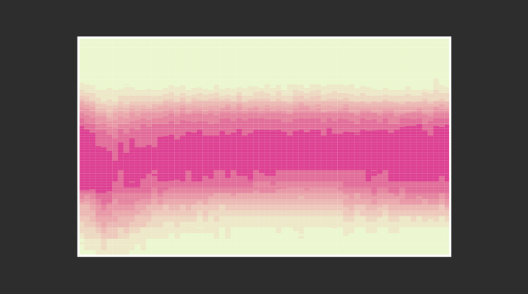
From the teenage years to college to adulthood through retirement, sleep is all over the place at first but then converges towards consistency.
No need to restrict ourselves to the most common types. There are thousands. Let’s look at all of them.
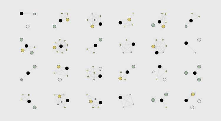
There are a lot of great craft breweries in the United States, but there is only so much time. This is the computed best way to get to the top rated breweries and how to maximize the beer tasting experience. Every journey begins with a single sip.
We know spending changes when you have more money. Here’s by how much.
These are my picks for the best of 2015. As usual, they could easily appear in a different order on a different day, and there are projects not on the list that were also excellent.
Some jobs tend towards higher divorce rates. Some towards lower. Salary also probably plays a role.
People cry for different reasons and some tend to cry more than others. What makes people cry the most?
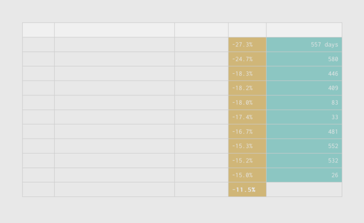
Households are seeing the value of their savings decrease significantly over a short period of time. Now seems like a good time to take the long-term point of view.
With absolute certainty, you will die. When will it happen? That is a trickier question. But we can run simulations to explore the possibilities.
This is a guide to protect ourselves and to preserve what is good about turning data into visual things.
A practical resource for beginners who want to visualize data for humans.